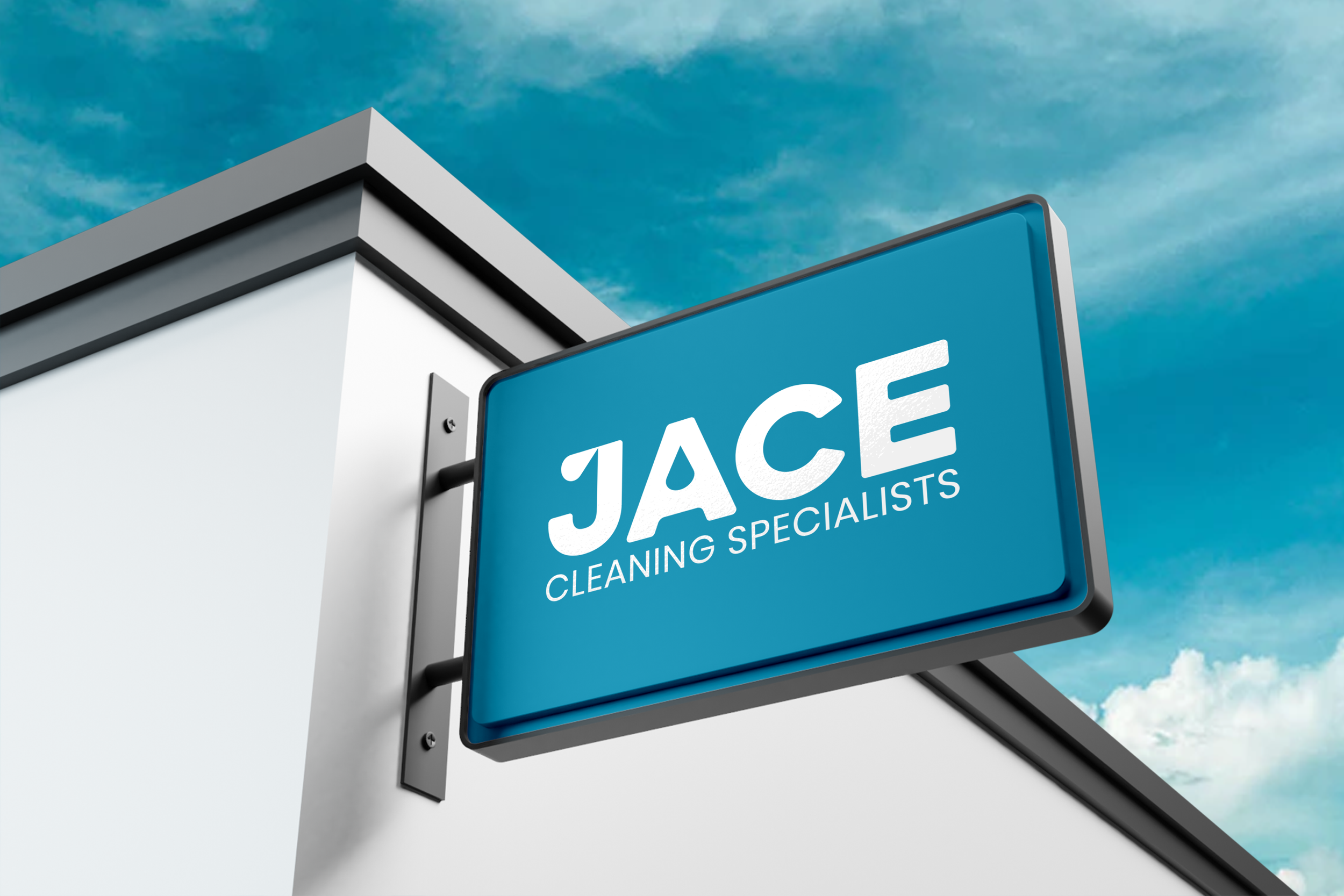
JACE CLEANING SPECIALISTS
Rebrand and Digital
The Design Brief
How can we strategically rebrand Jace Cleaning as the premier commercial cleaning service for builders, business owners, and property managers in Melbourne, Victoria, setting it apart from competitors by emphasising quality and reliability.
The Design Solution
This new logo is formed using capital letters for optimum impact. The corners of each letter have been rounded slightly to make it feel welcoming to clients.
The letter J wears a water droplet on the top, a subtle nod to the look and feel of water, whilst the letter A has another neatly placed droplet sitting snug in its middle, embodying cleanliness in a straightforward way. This playful manipulation of text not only brings out the letters' aquatic charm but also symbolises the simple yet impactful connection between water
and cleanliness.
This logo is clean, friendly and modern to help strengthen JACE’s presence and create greater distinction in the market.
Brand Values
Quality, Reliability, Customer Service
Key Words
Clean, Modern, Friendly


